Pioneer: The Visual Identity
Pioneer: The Visual Identity
Overview / The Challenge
The cannabis landscape was heavily "green-washed", dominated by pot leaves and predictable tropes. As Founder/CMO of the marketing analytics firm Pioneer Intelligence, my challenge was to carve out an identity that performed a difficult double duty: signal institutional credibility to data partners (the "Suit") while remaining culturally accessible to operators (the "Spirit"). We needed a brand that functioned like a financial terminal but spoke like an insider.
Strategy / The Blueprint
Very simply, I engineered Pioneer’s visual identity to signal data infrastructure rather than cannabis culture.
Utility-First Design: We weren't just branding a company; we were building a data product. The modular visual system would ensure instant user orientation across Pioneer’s functional pillars.
The "No-Green" Rule: In a sea of emerald, we opted out. We built a palette that positioned Pioneer as an objective observer of the market rather than just another player in it.
Execution / The Build
We executed a system that balanced the sobriety of data science with the recreational nature of the industry:
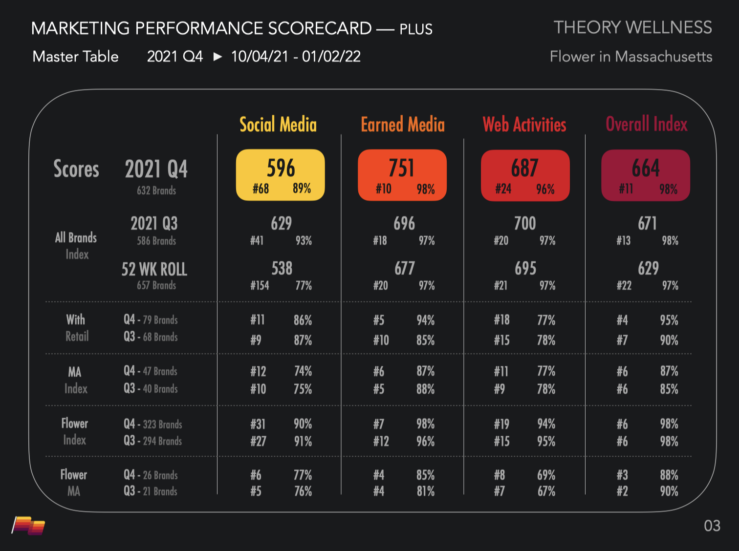
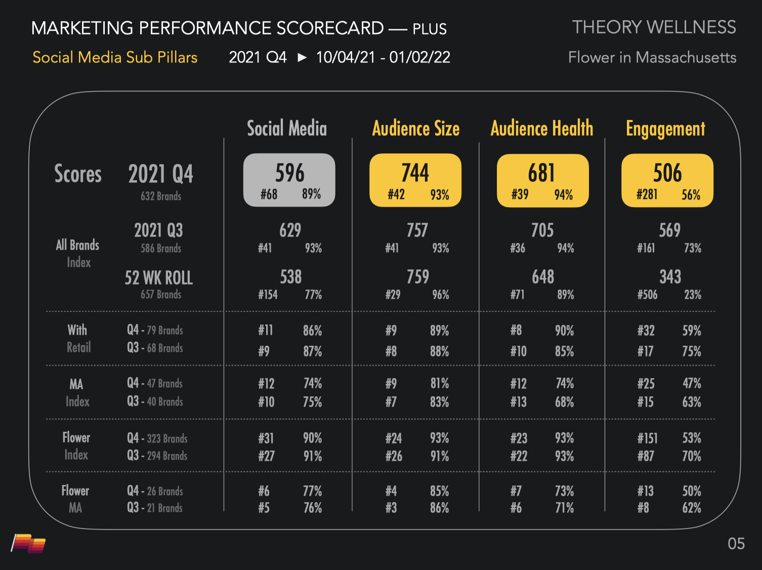
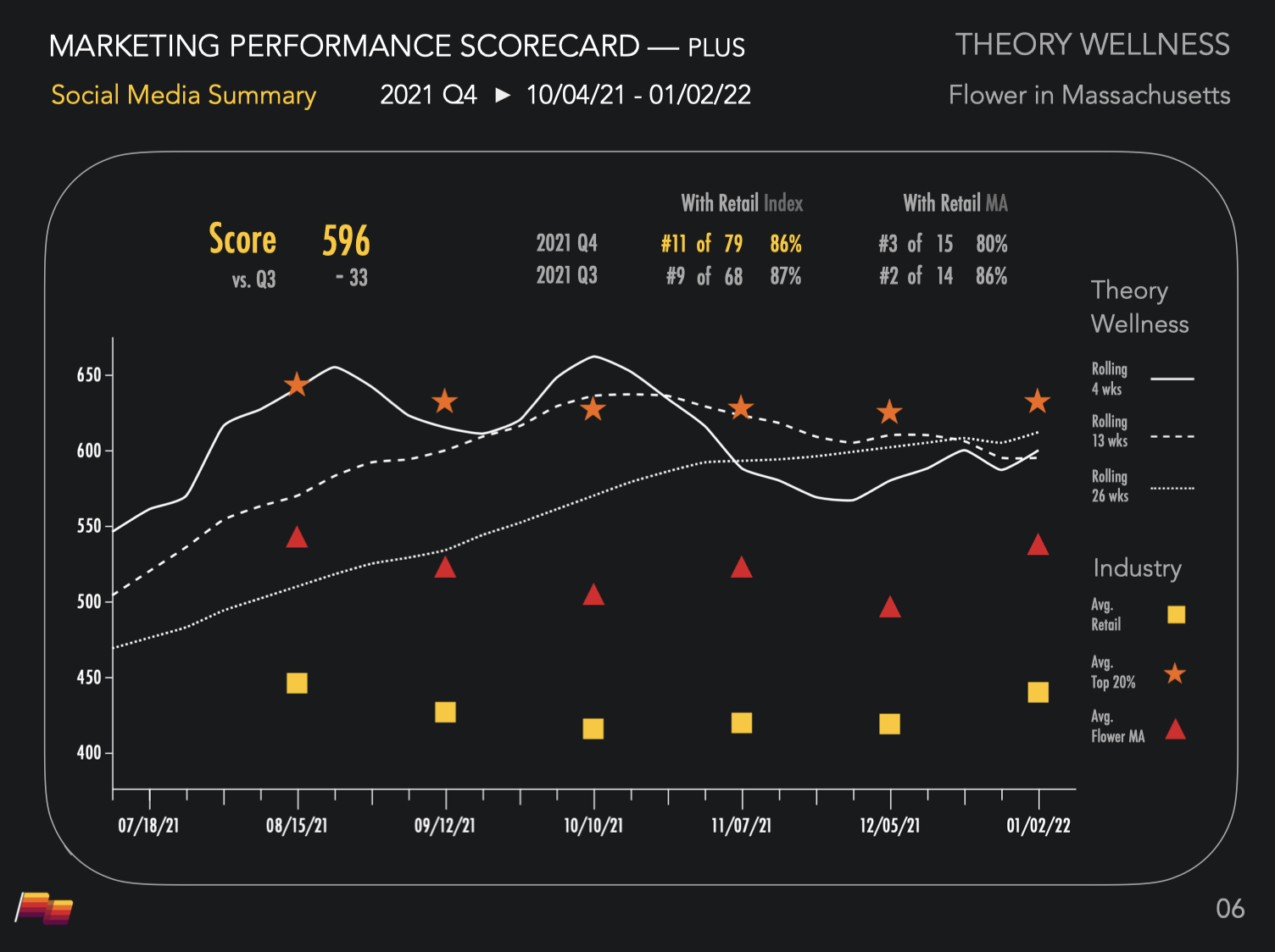
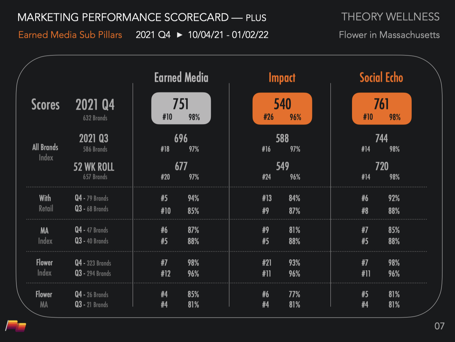
The Modular Spectrum: We used a functional warm-to-cool color spectrum (Yellow=Social, Orange=Earned, Red=Web, and Purple=Overall Performance). This wasn't decoration; it was information architecture that allowed users to digest complex scorecards at a glance.
Visual Authority (The Carbon Standard): To establish ourselves as the "System of Record," we standardized the chaos. We rendered all analyzed brand logos in uniform grayscale against a deep Carbon (#19181C) background. This stripped away the market's noise, forcing the viewer to focus purely on the data signal.
Typography as Infrastructure: To mimic the rigor of a financial terminal, we split the typeface hierarchy. We used Avenir for narrative clarity (Apple-esque) and Futura Condensed for dense data scorecards, ensuring legibility even at high density.
Bifurcated Voice: We designed a "Suit vs. Spirit" voice. The Brand Voice was objective and clean for reporting, while the Founder Voice was witty and culturally fluent, building a human connection behind the data.
Results / The Metrics
The identity successfully established Pioneer as a visual system of record:
Differentiation: The "No-Green" strategy cut through the noise, making our scorecards instantly recognizable in investor decks, boardrooms, and across industry feeds like LinkedIn.
Product Adoption: The modular system reduced cognitive load, supporting rapid adoption by over 500 active brands.
Audience Growth: The distinct voice fueled a rapid increase in newsletter subscribers, validating the appetite for a data brand, positioned as we were.
Learning / The Takeaways
Zig when they Zag. When a market floods toward a specific aesthetic (organic/green), a move in the opposite direction(data/purple), can often prove powerful. We learned that contrast is a cheap form of differentiation.
Design is Wayfinding. We treated color as code, not decoration, similar to how a subway map uses color to distinguish lines. We learned that for a complex data product, the visual identity can act as a navigation system, allowing users to orient themselves instantly before they even read the numbers.
-
Planting the Signal: The primary mark wasn't just a logo; it was a stylized flag. In a new, chaotic industry, the flag represented "discovery" and "staking territory." We animated it in a perpetual loop to ensure the brand felt like a living, transmitting signal across all digital touchpoints.